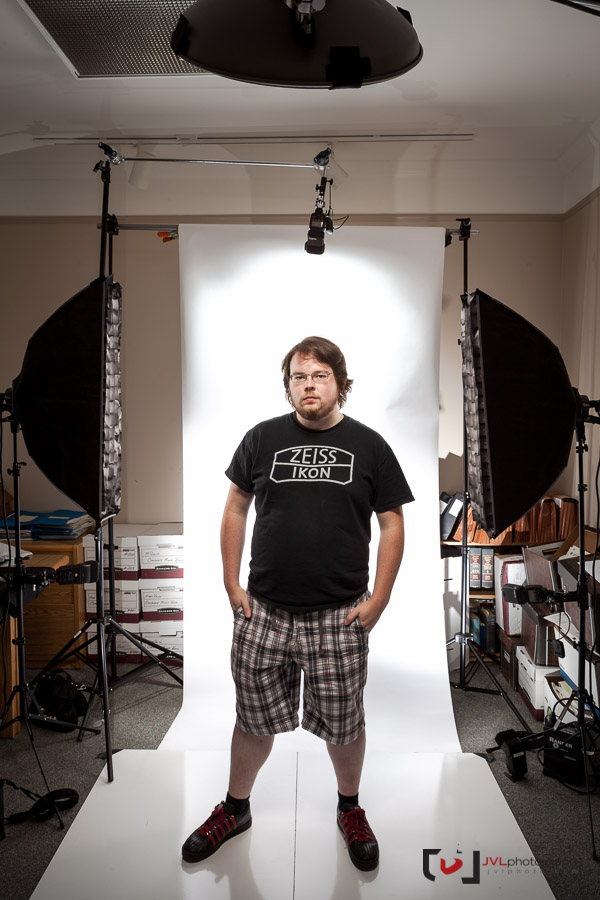
Over the summer I was contracted to produce the portraits for a new Ottawa law firm McNally Gervan LLP. They knew their logo branding was going to have a simple red and white design – any hint of direction is helpful when creating commercial images – so we opted to work with a seamless white backdrop for maximum versatility. The images you see above certainly have a consistent look and theme, we tried a number of different poses – the client seemed to like the *tough* arms crossed look – including full length (setup with stand-in Quinn below)

A larger version of this setup shot, with lighting details, is available on Flickr.
You can see we were working in a pretty tight space, an office/boardroom where we pushed all the boxes and tables out of the way just to maximize the depth we could shoot with. While our setup was geared towards the portraits, we went with a full-seamless in case the client wanted to show themselves as a team, grouped together against the white – I only did one of the principles, Matt, this way to show you what I mean

In the end I had to come back to shoot a new hire and one-do over, I simplified the setup (now knowing they weren’t going to select the full-body images) and, aside from the stronger rim lights at the side, the look carries through. I’m happy with the sharp, professional, yet modern look to their images, something that represents their sharp new business.
Nice series. I really like the full length ones actually.
Is it me or does the guy on the right's hand look way too long to be real?