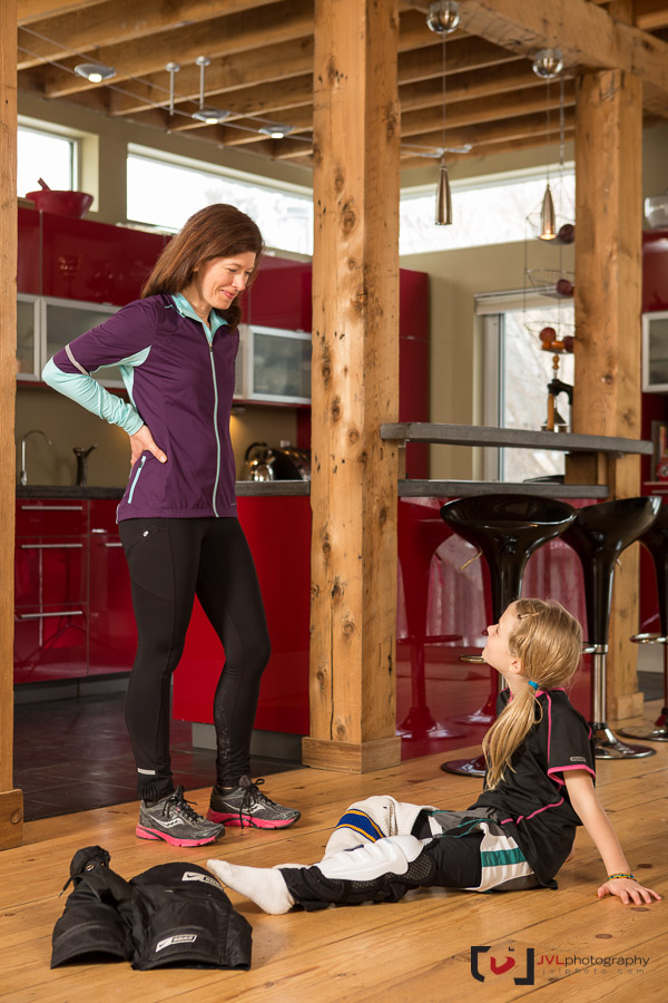
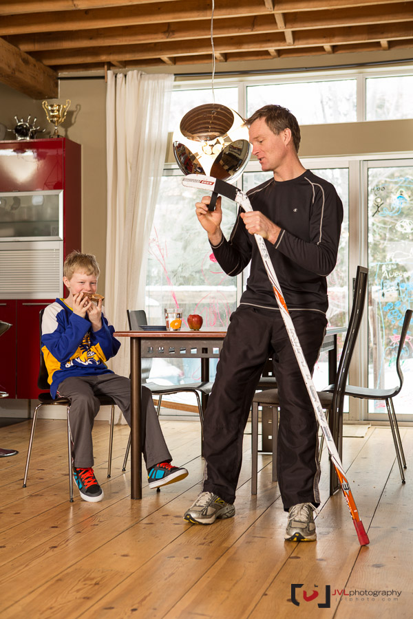
When the editor of Centre Ice Magazine proposing a two-page editorial spread I jumped at the chance. Every photographer wants their images printed big, and usually interior images are cropped down to make room for text and copy. In this case, the image was a function of the story, with text to be overlayed pointing at areas to keep your family healthy and fit.
From the minute the concept was explained to me, I knew exactly how I wanted to shoot it; a panoramic composite built on the same methods I use in my “extreme family” photography. I wanted to shoot the two-pages separately, vertically, but combine them into a single seamless image in post. This technique, as always, has the benefit of being able to focus on just a few subjects at a time, making sure we get the perfect shot for each family member.

The space and family couldn’t have been more perfect. The self-built re purposed wood construction of the home gave it a texture cozy feel, but it was modern enough to allow me space to back up, and shoot telephoto giving the image a shallower depth of field while maintaining focus on the subjects. The family is truly a hockey family; they all play.

I had photographed editorial and covers for Centre Ice before, but this project was one of the more technically challenging. Did I mention I had 48 hours from the call to deadline? No time for assistants on this one. Thanks to the article writer Kelly for being on-hand during the shoot – and finding a babysitter for my kids on a weekend with short notice 😉
We closed off the article with some simple, smiling family photos… campy but nice. You can see the finished image larger over on Flickr and the tearsheet over on my Facebook page.
Great concept, beautiful family, and gorgeous space.