It’s a great feeling when your editorial photography is strong enough for a university magazine to call you, without any prior relationship, to photograph their cover story. Gleefully accepting this important assignment to photograph Wilfred Laurier University Alumni Carolyn Wilkins, the first female Senior Deputy Governor of the Bank of Canada, I wasted no time in contacting the BOC to tour their current offices on Laurier Street (coincidence?), downtown Ottawa. Meeting with their media team, I knew in advance that I’d have an hour to setup and maybe an hour with Carolyn on shoot day. I took scouting photos so that I could build a shot list and precisely plan what gear I’d bring, and the order we’d need to set up.

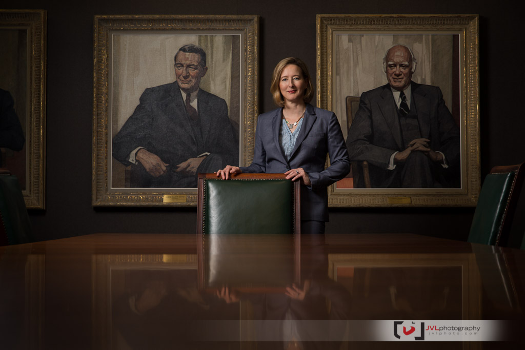
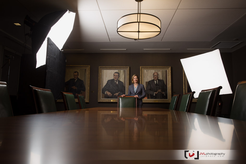
Luck favours the prepared, and on shoot-day Quinn and I arrived on-time for setup. We were working on the executive levels and went to work setting up in the main boardroom where I had envisioned an image of Carolyn standing among large painted portraits of past governors. I wanted the lighting to be soft and subtle with a gradual fall-off as not to draw a lot of attention to the lower half of the image (when shooting for editorial, I allow for images to have negative space that the editors can use to layout copy, or crop when necessary). The reflective table boardroom was a bit of an issue, so we flagged the large Elinchrom Octa I was using for our keylight with a large Westcott Scrim-Jim to cut the light. A second large Elinchrom Softbox was used as a very subtle fill at camera right.

I knew we might be shooting for the cover, and I wanted to create a strong and visually interesting image unlike any that the magazine had used before (many of which are tightly cropped images). Carolyn is a smart, strong and powerful woman, I wanted to convey that with a powerful full-body image. One of the few notable architectural elements at their current offices is a staircase between floors. I knew I wanted to frame her with these stairs and, to create a dramatic and powerful image I also knew we’d use some powerful and punchy lights. We used a small gridded beauty dish overhead and angled down to create a focused light, a sort spot-light, but softer and more flattering for this kind of portrait. I also used an Elinchrom Quadra ECO ringlflash as my fill-light so my shadows wouldn’t go completely black. A problem, however, was that the subjects shadow was being pushed directly backwards and the stairs were very dark. We fixed this by trying something unplanned, and added a Lumopro LP180 in-behind pointed directly up. I didn’t want to light the back of her head directly, but, using a bit of tape to cut the light, we managed to create a highlight along the metal edge of the stairs, and a completely unexpected pattern on the ceiling.
We later gel’d that blue to match the sky, and turned the power down, giving a complimentary cool tone to the warmer orange coming from the beauty dish.
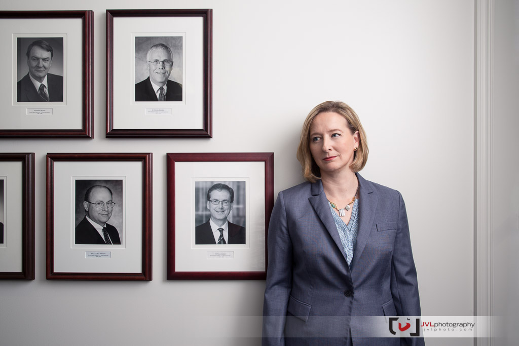
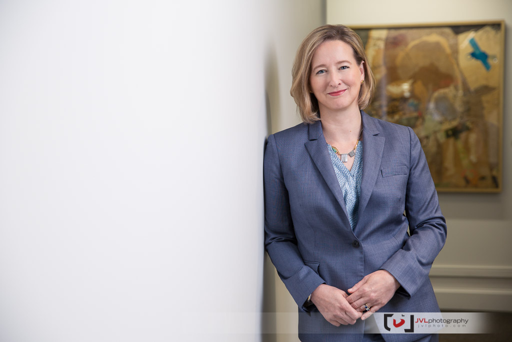
For the other shots I planned to use our large softbox hand-held on a boom pole using the battery powered Elinchrom Ranger Quadras. This would allow us to shoot the remainder of the editorial portraits quickly since the more complicated lighting setups were going to eat-up the bulk of our time. There was a wall of former Senior Deputy Governor black and portraits, that needed some colour added to the mix, as well as a few nice white walls, perfect for leaning, that gave us the freedom to comfortably shoot different vantages.


Another planned shot, heading up the stairs, was my only “action” photo which had our subject walking up the stairs as if heading to an important meeting. I love the cool tones of her suit mixed with the orange of the wood and carpet.
In the end we didn’t use our full-hour. We shot everything in 40 minutes, with the two major setups taking thirty minutes each. For print I felt so strongly about the cover shot that I edited it before they made their selects – they went with my choice for the cover. Sadly, the editorial space didn’t really find room for our other major boardroom setup, that’s just part of the job in editorial photography. I really like the image, but I understand; just because you’ve worked hard on something, doesn’t mean it’s good, and even if it is good, that doesn’t mean it’s going to get used. Still, as a photo just for me, I’m pretty pleased. You can check out the whole issue over at WLU’s website.